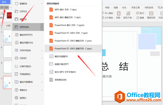
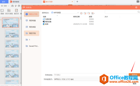
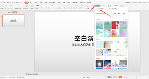
有时候由于工作需要,常在PPT中应用个性化模板,那么在PPT中如何新建自定义PPT主题呢?我们一起来看看吧!首先打开PPT演示文稿,创建四张空白文档(连按四下enter键),点击工作栏【视图......
2022-05-05 183 自定义PPT主题
如何做一个优美的幻灯演示?很复杂的一个命题,如果真说起来,可能一个月都说不完。但是一个优美的幻灯还是有章可循的。ERIN BEDFORD 有一文讲的不错。
Love it or hate it, PowerPoint is everywhere. 「Preparing a presentation」 has become synonymous to 「preparing a PowerPoint presentation」, but is this really a good attitude when it comes to communicating research? PowerPoint is a tool, and as with any tool, its true power comes not from the tool itself but from the one who holds it. Like dynamite, handled properly it can blast through the mountain that is communication between presenter and audience, but placed in the wrong hands and the audience may end up buried in the rubble.
I recently attended a great talk on the subject, which has got me thinking about presentations. What are the dangers of PowerPoint, how can we avoid them, and how can we make sure to keep focus on the content rather than the medium?
Know your audience. Without them, there is no presentation. When presenting to a group of experts in your field, skip over the in-depth intro and focus most of your slides on the knitty-gritty details; when presenting to a group of first-year chemistry students, do the opposite. But it’s not always this easy. What about mixed audiences? For example, I gave a short talk last month to a group of graduate students in materials science, which is so broad a field that many were not at all familiar with my subject. On the one hand, I wanted everyone in the audience to be able to understand my work; on the other hand, one of the goals of the series of talks was to find solutions to research problems we might be having, so it was important to present the details of my research. With only 10 minutes to talk, I couldn’t do both, so I had to identify who in the audience I wanted to present to. In this case, I decided that if I wanted tips from those in my field, I would have to present my results in detail, so I prepared a presentation with a brief introduction and focused more on my results. Many conferences are multidisciplinary, so choosing who in the audience you want to direct your talk to is an important first step in preparing a presentation.
听众人群不同,幻灯演示的方法也不同。
比如听众是专家级别的,就可以忽略彻底的介绍,而着重于详细的细节问题。如果是为学生做演示,那么就应该相反,应该重点介绍一下现状,而忽略一些细节问题。
但是有时情况可能更复杂,听从水平参差不齐,此时应该了解听众的需求。是想知道我所做的工作还是想了解我对于问题的解决方法。需求不同,展示的方式也就不同。
Rarely do we read a journal article linearly. We read the abstract, look at the tables and figures, glance at the conclusion, then maybe go back and read the rest. Because of this, journal articles are written in a predictable way, conducive to this jumping between sections (and online formats are making this even easier). Methods are separate from results, even when there are multiple steps involved.
With a presentation, you’re forcing the audience to follow you in a particular order, so make sure that the order makes sense. The linearity of a PowerPoint presentation means that the audience can’t make the same abstract connections that they can when reading a paper; by the time they’ve registered one concept, you’ve moved on to something else. Keep similar ideas together to reduce the need for remembering. This might mean that there is no methods section, but rather methods are discussed at the same time as their corresponding results. It also might mean that you repeat information or show the same graph twice if needed. Another useful tip is to use informative titles; rather than titling a slide 「Results」, use descriptive titles like 「A increases B」. This can provide a quick catch-up point for audience members who are still thinking about the previous slide.
当我们阅读论文时,很少是从头读到尾的。一般是先看一下摘要,文中的图表,浏览一下结论。如果认为该文值得一读,可以阅读剩下的部分。具体阅读方法可以参阅此文:如何选择和阅读科技论文。
但是幻灯演示不同。幻灯演示的时候不可能强迫听众跟着你的节奏来。因此幻灯演示的时候应该重点突出,有时对于重要的内容,可以重复。
There’s no point in using slides if no one can read them. Use big fonts, clear images, contrasting colors, motion only when it serves a purpose… There are numerous sites that give tips on the design aspects of a PowerPoint presentation; to start, check out the amusing Death by PowerPoint or one of Lifehackers’s posts on the subject. You don’t have to be a graphic designer to put together a good presentation. By taking some time to think about the clarity of your slides, the audience will be grateful.
尽量减少文字,使用不同的字体、颜色和图表表达一个主题。
PowerPoint has made us lazy. It’s too easy to put what we want to say on a slide and read it while the audience looks at the pretty pictures instead of focusing on the presenter. While having visuals associated with a presentation can be extremely useful, we don’t attend talks to look at data and read conclusions. Everything that is on a slide should be there only to help the audience understand what is being said. When planning on leaving a handout for interested audience members, prepare a separate handout that includes the necessary detail rather than trying to put everything on the slides. Or as another option, record your presentation and put it online.
PowerPoint is everywhere, and it’s not going away anytime soon. Used properly, it’s an excellent tool for conveying the complex information we deal with in research. But a bit of kindness towards the audience will go a long way-they’ll be more interested and our fascinating research will be remembered.
相关文章
有时候由于工作需要,常在PPT中应用个性化模板,那么在PPT中如何新建自定义PPT主题呢?我们一起来看看吧!首先打开PPT演示文稿,创建四张空白文档(连按四下enter键),点击工作栏【视图......
2022-05-05 183 自定义PPT主题
我们有时候在使用PPT过程中需要在PPT中批量插入图片三种方法,你知道怎样在PPT中批量插入图片吗?今天小编就教一下大家在PPT中批量插入图片三种方法。一、把多张图片批量插入到一张幻灯......
2022-05-05 355 PPT批量插入图片
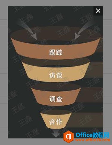
如何在PPT中绘制倒金字塔的逻辑表达效果老规矩,方法看看效果。是一个倒金字塔逻辑思路表达,表达经过层层筛选总结,最后合作得以实现的表达。这种有立体的环形的金字塔怎么绘制呢?......
2022-05-05 491 PPT绘制倒金字塔效果
用PPT演示文稿的操作中,我们会根据需要进行背景设置,如果想使用电脑上的图片,例如团队照片、网上下载的图片,我们该怎么操作呢?第一步,在页面空白处,点击右键,点击【设置背景......
2022-05-05 261 PPT背景